
Ready to get your finances up to date?
Timeframe: 5 Weeks
Role: UX Research, UI/UX Design, Prototyping, Usability Testing
View Final Prototype
The Challenge
Managing various financial accounts, such as savings, salary, and investments, can be overwhelming. Existing financial tools often provide delayed updates, lack personalization, and display generic dashboards that fail to reflect users' unique goals or preferences. This fragmentation leaves users without a clear, real-time view of their total wealth, making it difficult to make confident financial decisions quickly.
Research
Competitive analysis

Opportunities and gap in the market

Direct user interview
User Demographics & Assets
Ages ranged mostly from early 30s to mid-40s.
Common assets: bank salary accounts, shares/stocks, crypto, mutual funds, pensions
Common liabilities include loans, mortgages, and house expenses.
Main motivator:

Time saved

Simplicity

Budgeting and financial analysis

Concern over
security
User Persona
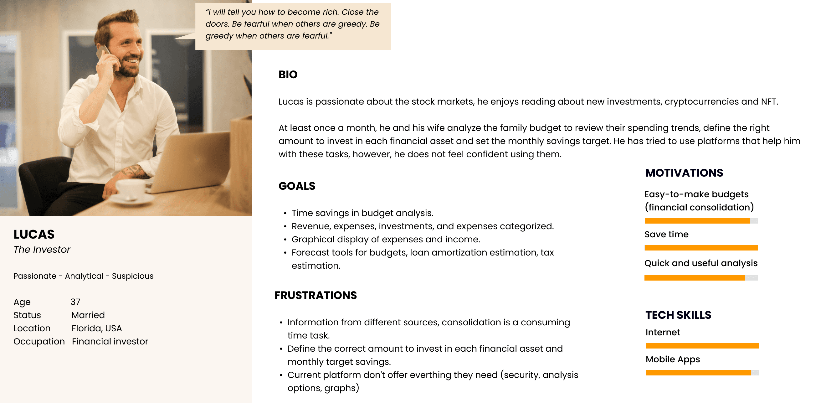
Define
This project focuses on exploring the need for a centralized, secure, and easy-to-use solution, one that helps users track assets and liabilities, analyze spending, and make informed financial decisions without switching between multiple apps or tools.
Ideate
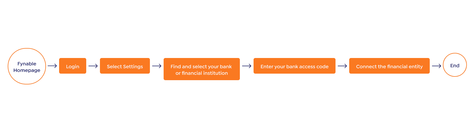
Goal: Add a financial account
Task Flow
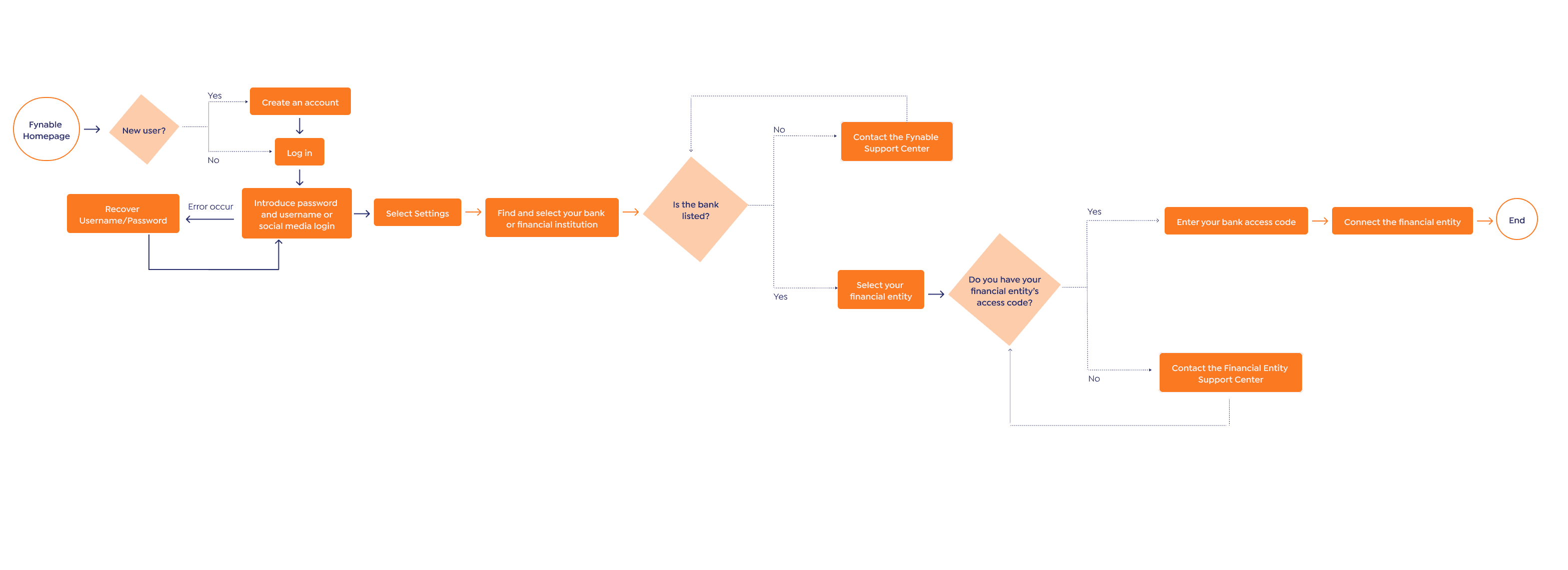
User Flow
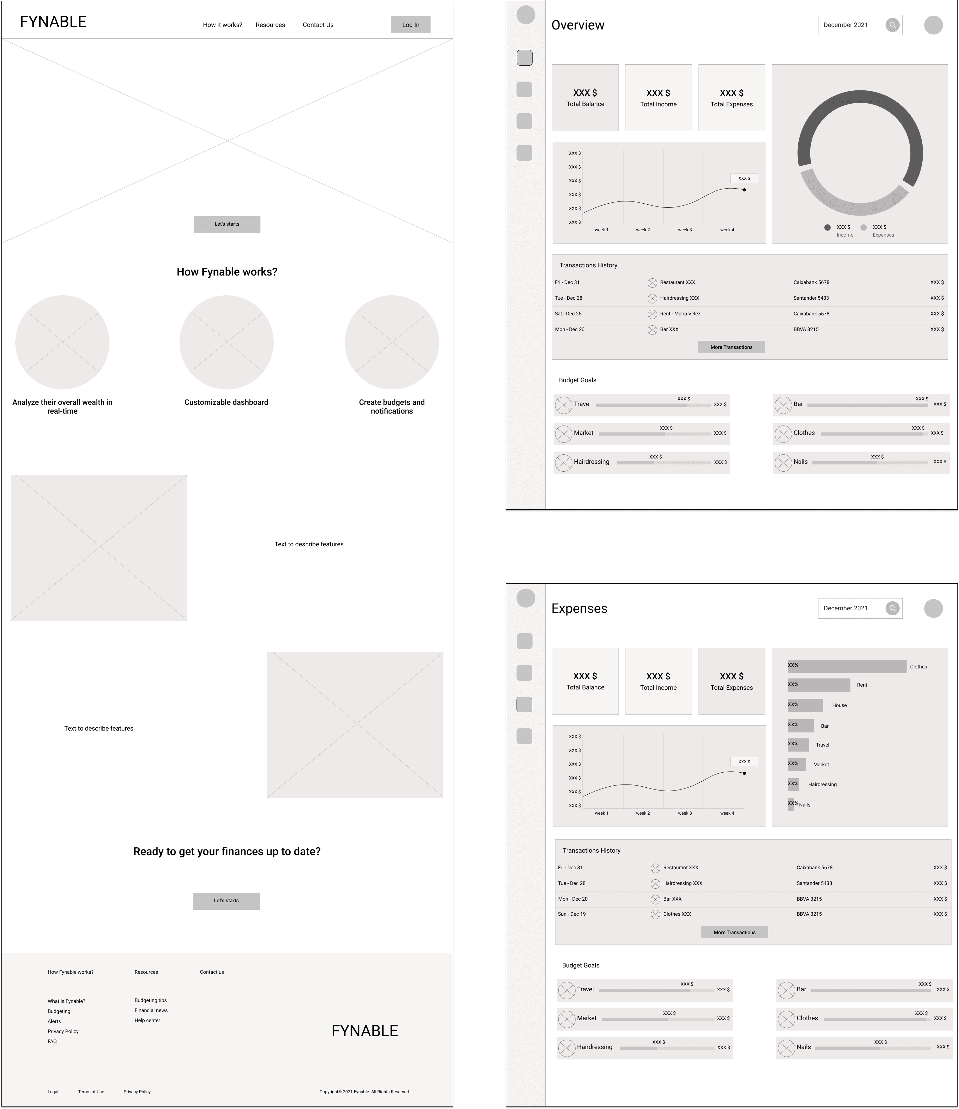
Mid-Fid Sketches
These mid-fidelity sketches present a more detailed layout and interaction design, showcasing key features like account linking, budget tracking, and financial insights
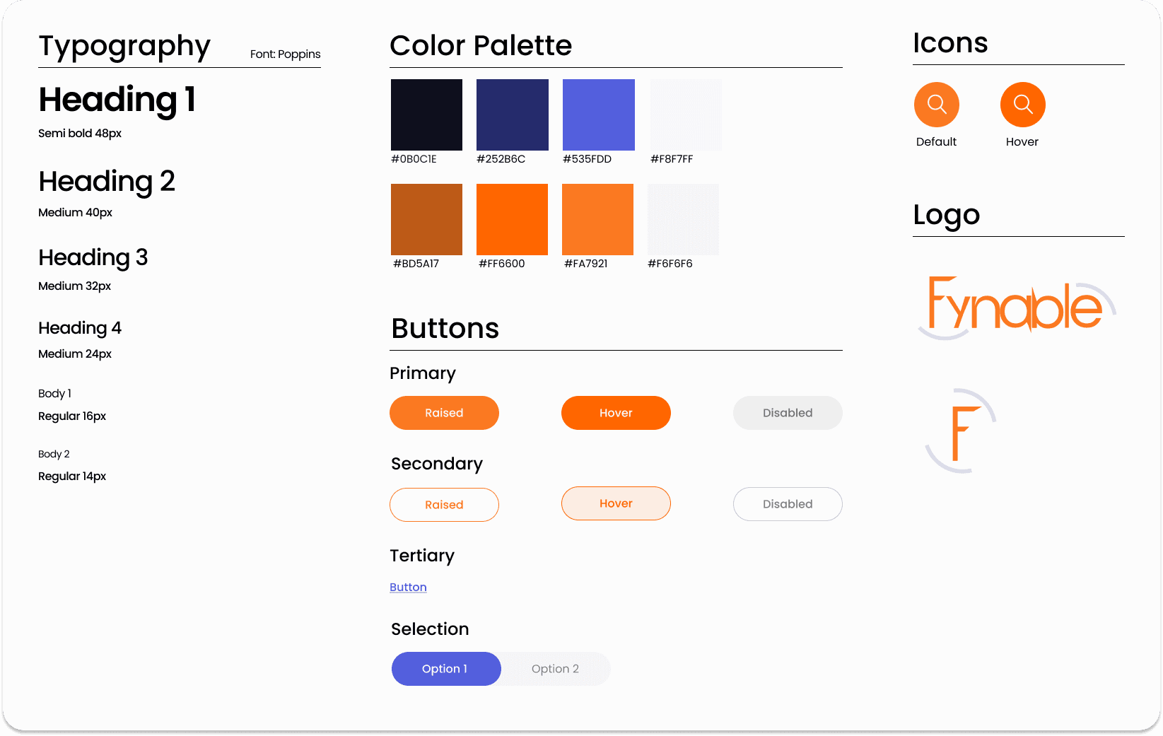
Branding - UI KIT
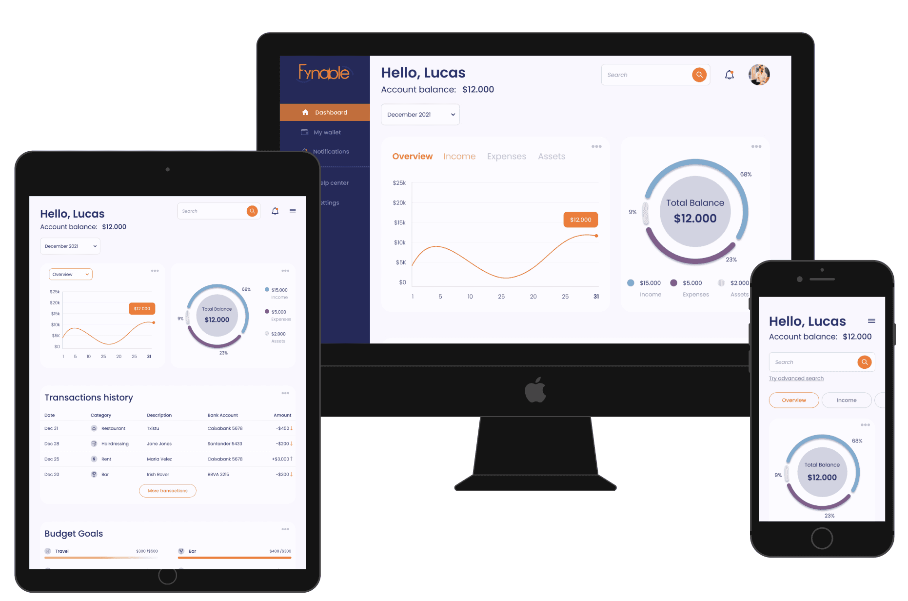
Prototype
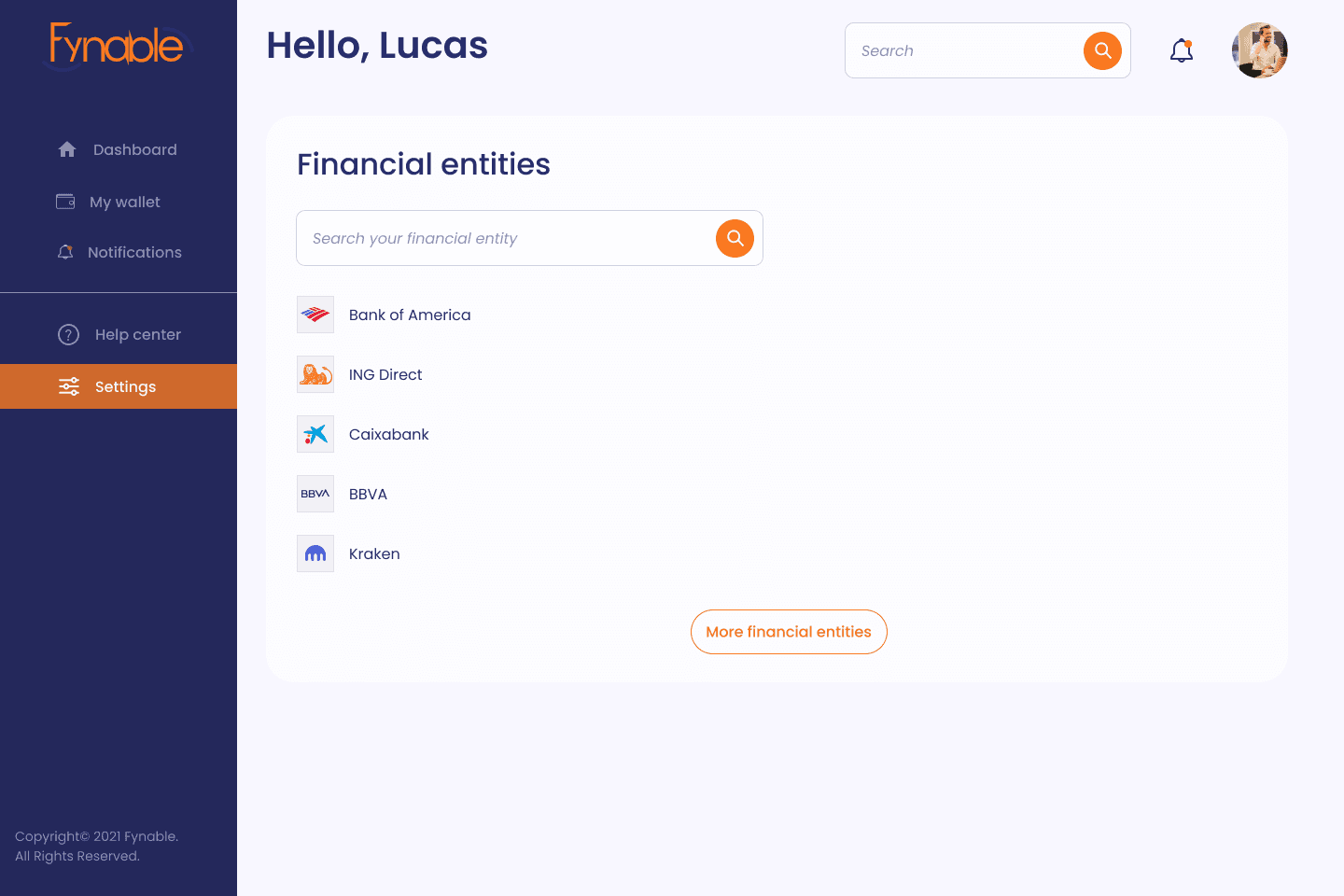
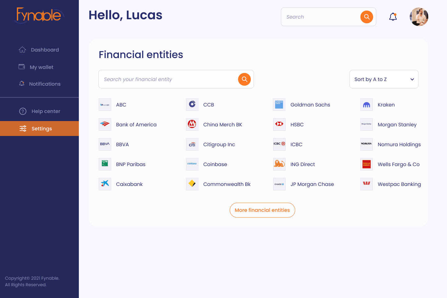
From concept to clarity: High-Fidelity Wireframes
This interactive prototype simulates the user experience, allowing users to navigate through key features and test core functionalities such as linking financial entities, viewing consolidated data, and tracking budgets
Testing
Usability testing
Scenario 1: Add Bank Accounts
User Feedback:
Users could not find Santander Bank in the list. They tried clicking “More Financial Entities,” but the option was disabled. They expected to use a search bar or sorting feature to locate their bank.
Solution:
Include a more comprehensive bank list and add filters (e.g., alphabetical or by country) to improve searchability.
Before
After
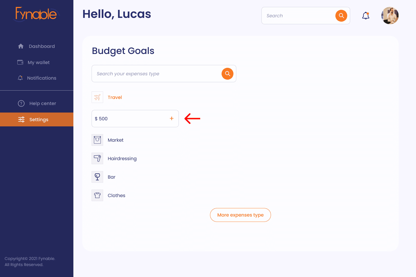
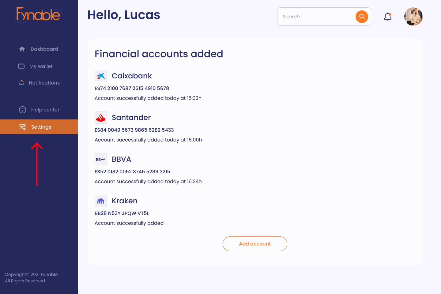
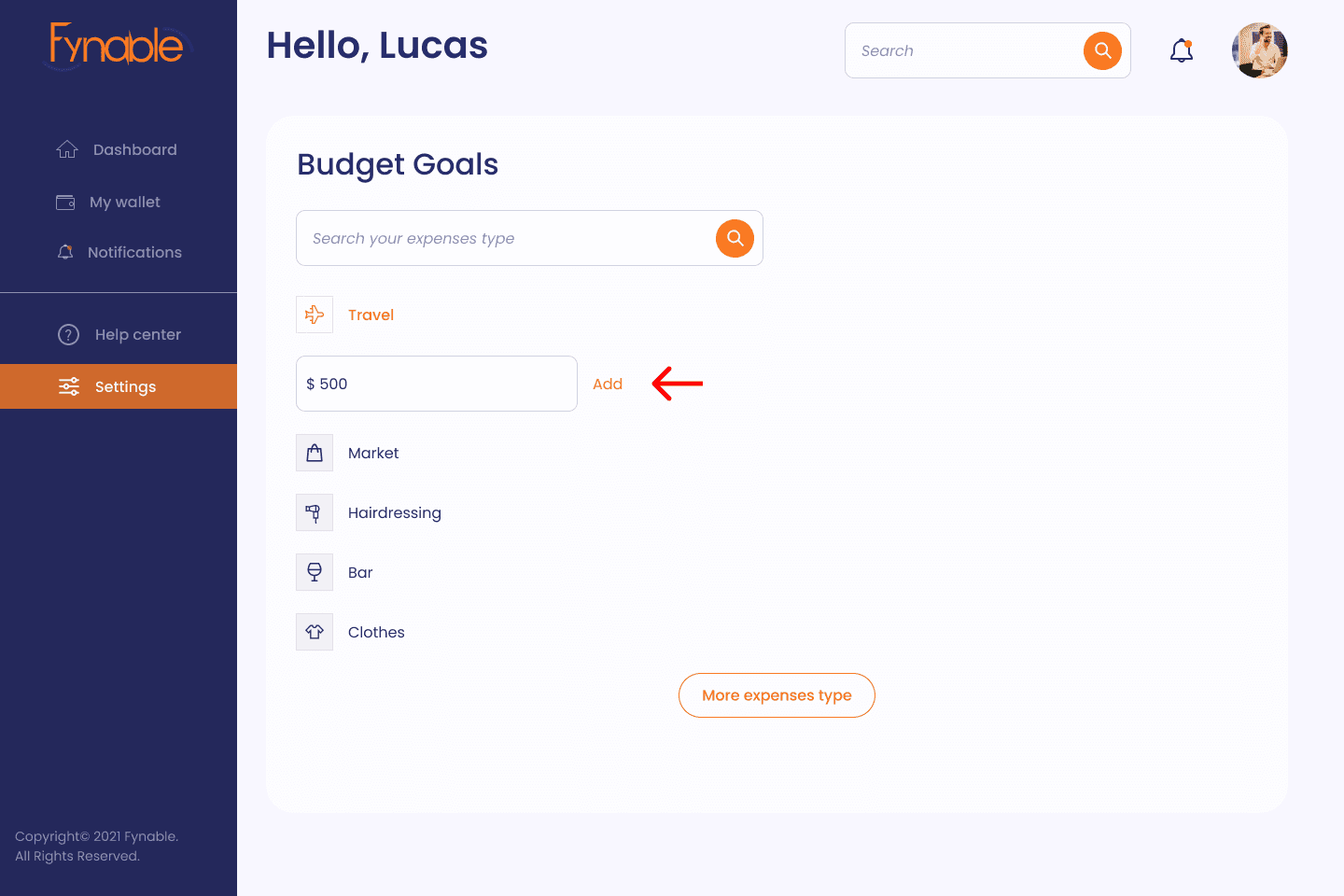
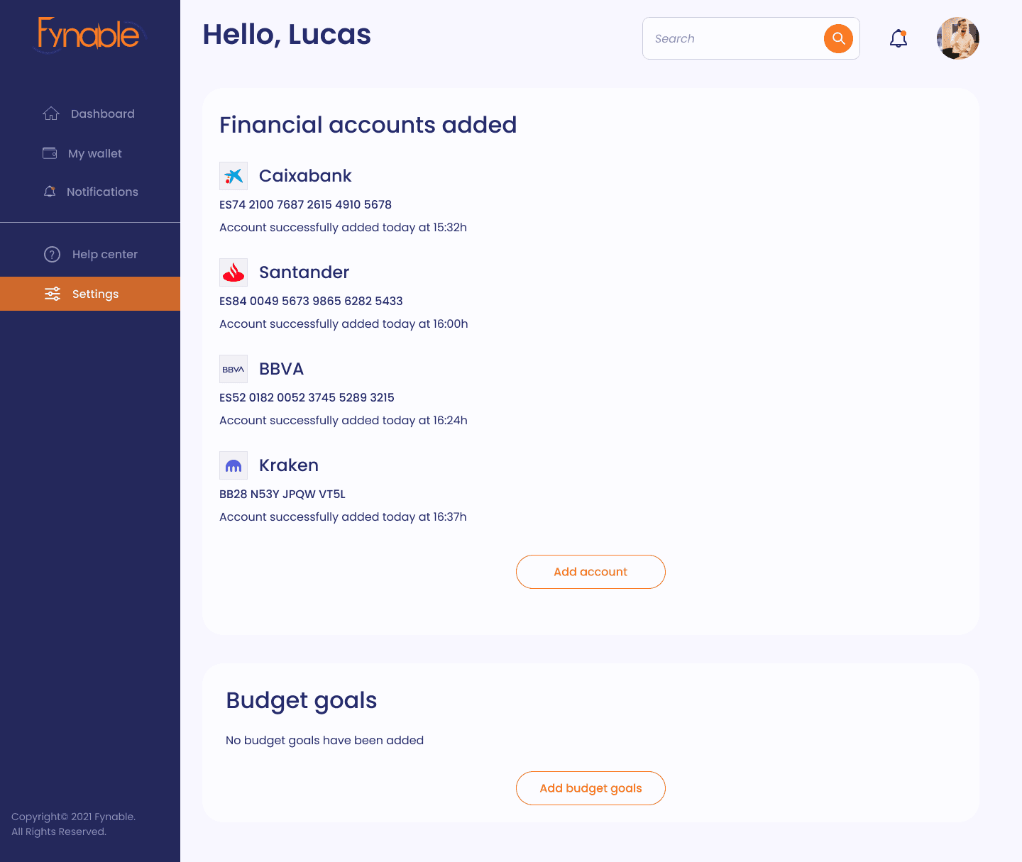
Scenario 2: Add Bank Accounts
User Feedback:
Users misunderstood the “+” icon; thought it meant adding money, not setting a budget
Users were lost after adding accounts; didn’t know to return to Settings.
Solution:
Replace “+” with the word “Add”
Automatically redirect users back to the initial Settings page after account linking
Before
After
Results
The improvements based on usability testing led to:
A wider bank list with sorting and search options to ease account linking
An updated user flow that redirects users back to the settings page after adding accounts
Reinforced the overall user journey, making it more intuitive and seamless
View Final Prototype
What I learned
Usability testing reinforced the importance of guiding the user at every step and validating even the smallest UI elements. Sometimes a simple label or transition can remove uncertainty and create a more seamless experience.
The changes made after testing significantly improved the overall experience; users felt more confident, guided, and in control of their finances.